On this page
Style the Sign-In Widget (third generation)
This guide explains how to customize the Sign-In Widget (third generation) for redirect authentication.
Note: This document is only for Okta Identity Engine. If you’re using Okta Classic Engine, see Style the sign-in page. See Identify your Okta solution (opens new window) to determine your Okta version.
Learning outcomes
- Enable the third-generation widget.
- Learn about design tokens.
- Call the JS API using design tokens.
What you need
Sample code
About the Sign-In Widget (third generation)
The Sign-In Widget enables the following:
- Registration
- Enrollment
- Verification
- Recovery experiences for your users
It's where everyone in your org starts their Okta session.
The third generation of the Sign-In Widget offers the same user experience as the second generation. It adds accessibility improvements to the following:
- Color contrast
- Focus management
- Screen reader behavior
See Sign-In Widget, third generation (opens new window) to verify if the third generation is right for your org.
Palette generation and accessibility
The third generation of the Sign-In Widget offers autogenerated palettes that preserve accessible color contrast ratios. See the Odyssey by Okta design system (opens new window).
Consider the following when adjusting the theme of your org:
If you don't modify your theme, your org uses the default Okta palette.
If you modify your theme using the primary color in the Admin Console, Okta generates an accessible palette. However, the generated palette might not map exactly to your brand's palette. See Set a theme for your org (opens new window).
If you modify your theme using design tokens, you can create themes that closely align with your brand's palette. For example, you can use the code editor to modify
PalettePrimaryMainto have the exact hex code of your brand. However, if you use design tokens it's at your own risk. You're responsible for your use of the tokens and any broken accessibility ratios that could result. See Use design tokens.
Upgrade to the third generation
Note: If you have a new Identity Engine org, the third generation Sign-In Widget isn't enabled by default.
To upgrade to the third generation:
- In the Admin Console, go to Customizations > Brands.
- Select a brand.
- Go to the Pages tab, and then click Edit or Configure for the Sign-in page.
- Click the Settings tab.
- In the Sign-In Widget version section, click Edit.
- Turn on the Use the third generation toggle.
- Click Save to draft.
- Click Publish.
Customizations that you have in the second-generation Sign-In Widget don't appear if you move to the third generation. To recreate them, see Use design tokens.
To pin to a specific version, see Pin a specific third-generation Sign-In Widget (opens new window).
Use the code editor
Use the code editor to add design tokens to your code. Design tokens call a JavaScript API.
Note: You can only enable the code editor if you configure a custom domain.
See Customization examples for snippets that you can update and use.
In the Admin Console, go to Customizations > Brands, and then select the brand you want.
On the Pages tab, click Configure in the Sign-in page panel.
To open the code editor, click the Code editor toggle.
Make changes directly in the editor. See Use design tokens.
- Click Save to draft, then Preview, Revert, or Publish.
- Select Compare with published version to see the difference between your edited version and the published version. You can choose between a split view and a unified view.
Note: To discard your changes without publishing them, click Revert changes or click the Code editor toggle again. Turning off the code editor restores the default JavaScript code.
About the afterRender function
The third generation of the Sign-In Widget is built on Preact (opens new window), a lightweight React alternative. This means that the afterRender (opens new window) function doesn't work when used to make DOM manipulations and other render-related side effects. If you use afterRender for DOM manipulations, the Okta Sign-In Widget reverts any customizations to default settings. See Components and Hooks must be pure (opens new window).
- To use
afterRenderfor DOM manipulations, consider using theMutationObserverfunction. - To use
afterRenderfor non-DOM manipulations, you don't need theMutationObserverfunction.
Use MutationObserver for DOM manipulations
To prevent the third generation of the Sign-In Widget from reverting your afterRender customizations, use the DOM MutationObserver function. See MutationObserver (opens new window).
To update UI elements, consider the following example:
<script type="text/javascript" nonce="{{nonceValue}}">
    var config = OktaUtil.getSignInWidgetConfig();

    var oktaSiwRoot = document.querySelector('#okta-login-container');
    // The following allows you to reference the context from each render
    var contextObj = {};
    function cb(mutations, observer) {
      // For the primary auth form, updates the button label
      if (contextObj.formName === 'identify') {
        var el = document.querySelector('[data-type="save"]');
        if (el) { el.textContent = 'Some new label'; }
      }
      // For the reset-authenticator view, updates the button label
      if (contextObj.formName === 'reset-authenticator') {
        var el = document.querySelector('[data-type="save"]');
        if (el) { el.textContent = 'A different label'; }
      }
    }
    // Initializes the mutation observer object
    var observer = new MutationObserver(cb);

    // Renders the Okta Sign-In Widget
    var oktaSignIn = new OktaSignIn(config);

    // The following varies based on your configuration
    oktaSignIn.renderEl({ el: '#okta-login-container' }, OktaUtil.completeLogin, function (error) {
       console.log(error.message, error);
    });

    oktaSignIn.on('afterRender', function (ctx) { // ← Restores the context
      // Resets the global context object for reference using the callback function
      contextObj = context;
      // The following condition only executes the observer for specific views/forms
      if (context.formName === 'identify' || context.formName === 'reset-authenticator') {
        // Pauses
        observer.disconnect();

        // Calls once after initial render
        cb();

        // Observes for re-renders
        observer.observe(oktaSiwRoot, {
          subtree: true,
          childList: true,
          attributes: true,
          characterData: true,
        });
      }
    });

 </script>
User afterRender for non-Dom manipulations
The third generation can use the afterRender function for non-DOM manipulations without extra logic. The following example doesn't update the UI, so it doesn't need the MutationObserver. Instead, it sends a log to your external logging service:
<script type="text/javascript" nonce="{{nonceValue}}">
   var config = OktaUtil.getSignInWidgetConfig();

   // Renders the Okta Sign-In Widget
   var oktaSignIn = new OktaSignIn(config);

   // The following varies based on your own configuration
   oktaSignIn.renderEl({ el: '#okta-login-container' }, OktaUtil.completeLogin, function (error) {
      console.log(error.message, error);
   });

   oktaSignIn.on('afterRender', function (context) {
      if (context.formName === 'identify') {
         // Sends a log to your external logging service indicating a customer landed on this view
         someExternalLoggingService.log('Rendered Primary auth form');
      }
   });

</script>
Use design tokens
Design tokens make the Sign-In Widget's visual style consistent and easier to update. Tokens replace static values to customize the following:
- Color
- Border
- Font family
- Font size
- Font weight
- Line height
- Spacing
Pass the design token values into the OktaSignIn constructor. For example:
new OktaSignIn({
  theme: {
    tokens: {
      PalettePrimaryMain: '#D11DCA',
      TypographyColorBody: '#00297A',
      TypographyColorHeading: '#00297A',
      TypographyFamilyHeading: 'Helvetica',
      TypographyFamilyBody: 'Helvetica',
      TypographyWeightHeading: 600,
      BorderRadiusMain: '24px',
      Spacing5: '2.85714286rem',
    }
  }
});
The following is a list of available design tokens with default values. See Customization examples:
{
  "BorderColorDisplay": "#e1e1e1",
  "BorderColorDisabled": "#e1e1e1",
  "BorderColorDangerLight": "#fe8f7a",
  "BorderColorDangerControl": "#e72500",
  "BorderColorDangerDark": "#951800",
  "BorderColorPrimaryControl": "#546be7",
  "BorderColorPrimaryDark": "#2e40a5",
  "BorderRadiusTight": "4px",
  "BorderRadiusMain": "6px",
  "BorderStyleMain": "solid",
  "BorderWidthMain": "1px",
  "FocusOutlineColorPrimary": "#546be7",
  "FocusOutlineOffsetMain": "2px",
  "FocusOutlineOffsetTight": "0",
  "FocusOutlineStyle": "solid",
  "FocusOutlineWidthMain": "2px",
  "FocusOutlineWidthTight": "1px",
  "HueNeutral50": "#f4f4f4",
  "HueNeutral100": "#ededed",
  "HueNeutral200": "#e1e1e1",
  "HueNeutral300": "#cbcbcb",
  "HueNeutral400": "#aeaeae",
  "HueNeutral500": "#8d8d8d",
  "HueNeutral600": "#6e6e6e",
  "HueNeutral700": "#4b4b4b",
  "HueNeutral800": "#383838",
  "HueNeutral900": "#272727",
  "HueNeutralWhite": "#ffffff",
  "HueBlue50": "#f2f3fd",
  "HueBlue100": "#dbe0fa",
  "HueBlue200": "#c1c9f6",
  "HueBlue300": "#9daaf1",
  "HueBlue400": "#7286eb",
  "HueBlue500": "#546be7",
  "HueBlue600": "#4c64e1",
  "HueBlue700": "#2e40a5",
  "HueBlue800": "#22307c",
  "HueBlue900": "#182257",
  "HueGreen50": "#defae7",
  "HueGreen100": "#94f5b3",
  "HueGreen200": "#7be09e",
  "HueGreen300": "#59c282",
  "HueGreen400": "#31a061",
  "HueGreen500": "#16884a",
  "HueGreen600": "#197f48",
  "HueGreen700": "#0e562f",
  "HueGreen800": "#0a4023",
  "HueGreen900": "#072e19",
  "HueRed50": "#fff0ee",
  "HueRed100": "#ffd8d1",
  "HueRed200": "#febbae",
  "HueRed300": "#fe8f7a",
  "HueRed400": "#fd4e2d",
  "HueRed500": "#e72500",
  "HueRed600": "#d92300",
  "HueRed700": "#951800",
  "HueRed800": "#711200",
  "HueRed900": "#500d00",
  "HueYellow50": "#fcf6ac",
  "HueYellow100": "#fce101",
  "HueYellow200": "#f9c503",
  "HueYellow300": "#eb9e05",
  "HueYellow400": "#bf8004",
  "HueYellow500": "#a16c03",
  "HueYellow600": "#966603",
  "HueYellow700": "#664402",
  "HueYellow800": "#4c3302",
  "HueYellow900": "#352401",
  "PalettePrimaryLighter": "#f2f3fd",
  "PalettePrimaryLight": "#9daaf1",
  "PalettePrimaryMain": "#546be7",
  "PalettePrimaryDark": "#2e40a5",
  "PalettePrimaryDarker": "#22307c",
  "PalettePrimaryText": "#4c64e1",
  "PalettePrimaryHeading": "#182257",
  "PalettePrimaryHighlight": "#dbe0fa",
  "PaletteDangerLighter": "#fff0ee",
  "PaletteDangerLight": "#fe8f7a",
  "PaletteDangerMain": "#e72500",
  "PaletteDangerDark": "#951800",
  "PaletteDangerDarker": "#711200",
  "PaletteDangerText": "#d92300",
  "PaletteDangerHeading": "#500d00",
  "PaletteDangerHighlight": "#ffd8d1",
  "PaletteWarningLighter": "#fcf6ac",
  "PaletteWarningLight": "#eb9e05",
  "PaletteWarningMain": "#a16c03",
  "PaletteWarningDark": "#664402",
  "PaletteWarningDarker": "#4c3302",
  "PaletteWarningText": "#966603",
  "PaletteWarningHeading": "#352401",
  "PaletteWarningHighlight": "#fce101",
  "PaletteSuccessLighter": "#defae7",
  "PaletteSuccessLight": "#59c282",
  "PaletteSuccessMain": "#16884a",
  "PaletteSuccessDark": "#0e562f",
  "PaletteSuccessDarker": "#0a4023",
  "PaletteSuccessText": "#197f48",
  "PaletteSuccessHeading": "#072e19",
  "PaletteSuccessHighlight": "#94f5b3",
  "Spacing0": "0",
  "Spacing1": "0.28571429rem",
  "Spacing2": "0.57142857rem",
  "Spacing3": "0.85714286rem",
  "Spacing4": "1.14285714rem",
  "Spacing5": "1.71428571rem",
  "Spacing6": "2.28571429rem",
  "Spacing7": "2.85714286rem",
  "Spacing8": "3.42857143rem",
  "Spacing9": "4rem",
  "TransitionDurationMain": "100ms",
  "TypographyColorBody": "#272727",
  "TypographyColorHeading": "#272727",
  "TypographyColorInverse": "#ffffff",
  "TypographyColorSupport": "#4b4b4b",
  "TypographyColorSubordinate": "#6e6e6e",
  "TypographyColorDisabled": "#aeaeae",
  "TypographyColorAction": "#4c64e1",
  "TypographyColorDanger": "#d92300",
  "TypographyColorSuccess": "#197f48",
  "TypographyColorWarning": "#966603",
  "TypographyFamilyBody": "'Inter', '-apple-system', 'BlinkMacSystemFont', 'Segoe UI', 'Oxygen-Sans', 'Ubuntu', 'Cantarell', 'Helvetica Neue', sans-serif",
  "TypographyFamilyHeading": "'Aeonik', 'Inter', '-apple-system', 'BlinkMacSystemFont', 'Segoe UI', 'Oxygen-Sans', 'Ubuntu', 'Cantarell', 'Helvetica Neue', sans-serif",
  "TypographyFamilyButton": "'Aeonik', 'Inter', '-apple-system', 'BlinkMacSystemFont', 'Segoe UI', 'Oxygen-Sans', 'Ubuntu', 'Cantarell', 'Helvetica Neue', sans-serif",
  "TypographySizeSubordinate": "0.857rem",
  "TypographySizeBody": "1rem",
  "TypographySizeHeading6": "1.143rem",
  "TypographySizeHeading5": "1.286rem",
  "TypographySizeHeading4": "1.571rem",
  "TypographySizeHeading3": "2rem",
  "TypographySizeHeading2": "2.286rem",
  "TypographySizeHeading1": "2.571rem",
  "TypographyWeightBody": "400",
  "TypographyWeightBodyBold": "600",
  "TypographyWeightHeading": "500",
  "TypographyWeightHeadingBold": "700",
  "TypographyLineHeightBody": 1.5,
  "TypographyLineHeightUi": 1.2,
  "TypographyLineHeightOverline": 1.3,
  "TypographyLineHeightHeading6": 1.3,
  "TypographyLineHeightHeading5": 1.3,
  "TypographyLineHeightHeading4": 1.25,
  "TypographyLineHeightHeading3": 1.25,
  "TypographyLineHeightHeading2": 1.2,
  "TypographyLineHeightHeading1": 1.2,
  "TypographyLineLengthMax": "55ch"
}
Customization examples
The following examples illustrate the impact of basic changes:
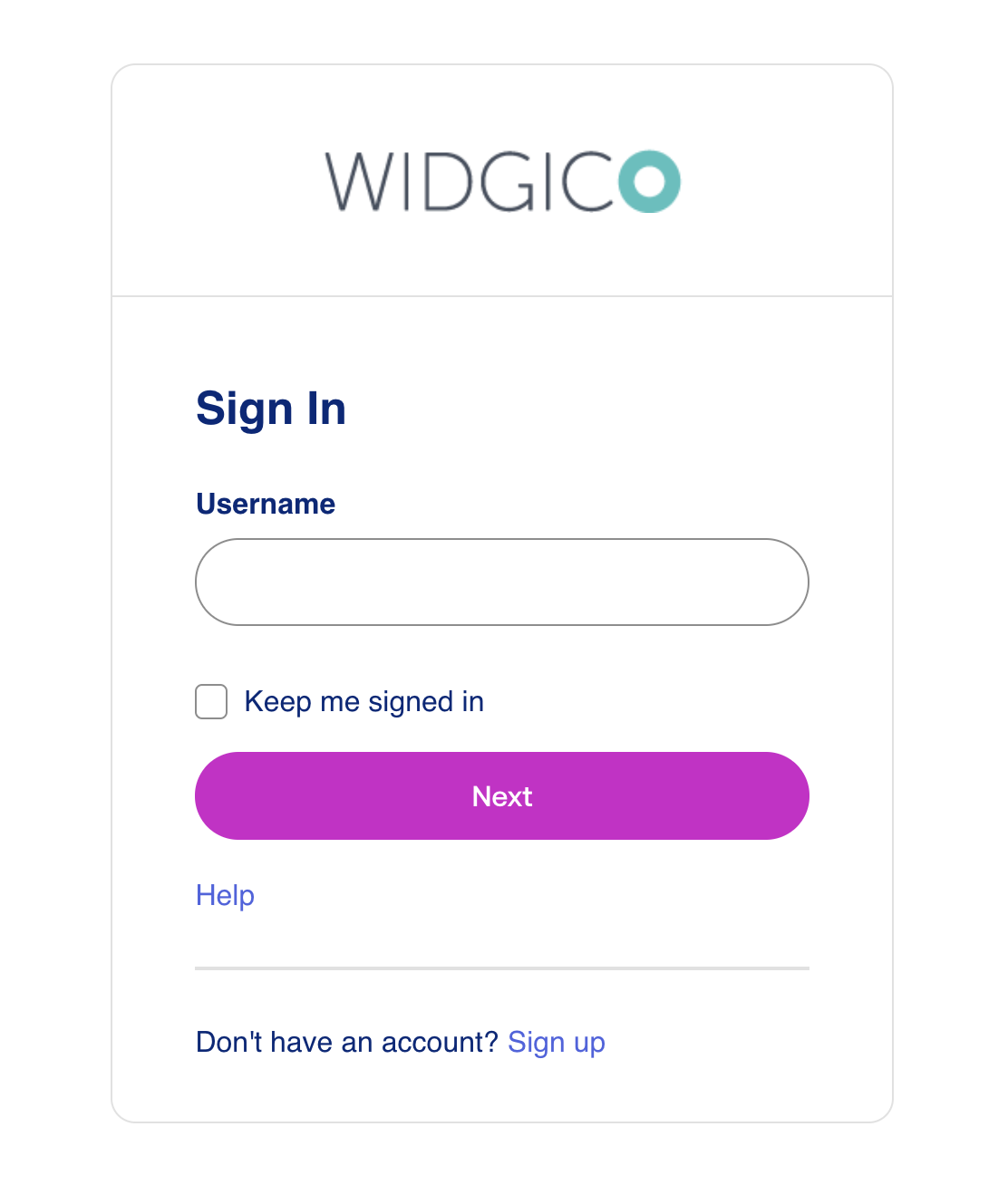
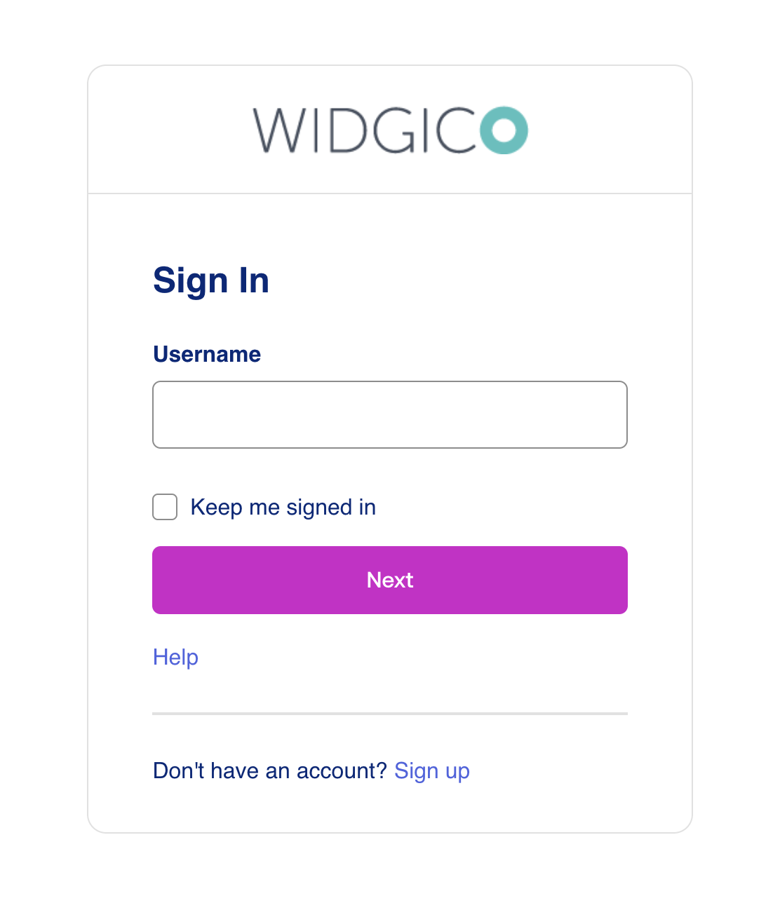
Color change
PalettePrimaryMainfrom#546be7(blue) to#D11DCA(magenta)TypographyColorBodyfrom#272727(dark gray) to#00297A(navy blue)TypographyColorHeadingfrom#272727(dark gray) to#00297A(navy blue)
Before color changes

After color changes

Text change
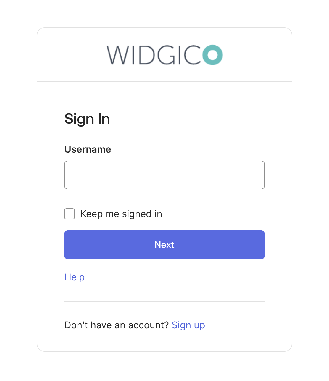
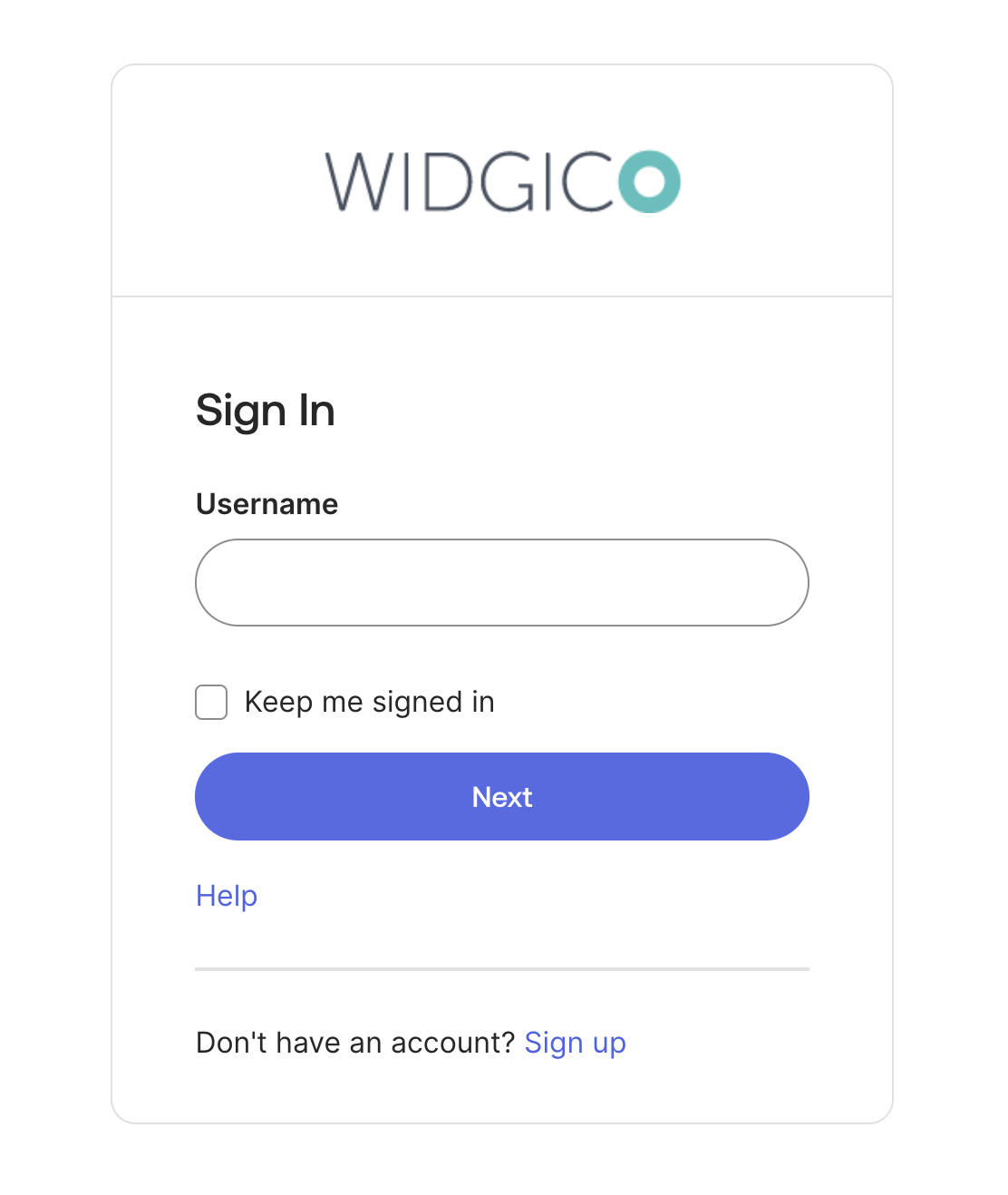
TypographyFamilyHeadingfrom"'Aeonik', 'Inter', '-apple-system', 'BlinkMacSystemFont', 'Segoe UI', 'Roboto', 'Oxygen-Sans', 'Ubuntu', 'Cantarell', 'Helvetica Neue', sans-serif"(default) to"Helvetica"TypographyWeightHeadingfrom500(semibold, default) to600(bold)TypographyFamilyBodyfrom"'Inter', '-apple-system', 'BlinkMacSystemFont', 'Segoe UI', 'Roboto', 'Oxygen-Sans', 'Ubuntu', 'Cantarell', 'Helvetica Neue', sans-serif"(default) to"Helvetica"
Before text changes
After text changes

After color and text changes
Border radius and spacing change
BorderRadiusMainfrom6pxto24pxSpacing5from1.71428571rem(24 px, default) to2.85714286rem(40 px)
Before border radius and spacing changes

After border radius and spacing changes
After border, spacing, text, and color changes